
Find the right place.
Book it without friction.
A responsive workplace-booking experience that turns discovery, comparison, and checkout into one clear journey.
PRODUCT STRATEGY · UX/UI · RESPONSIVE DESIGN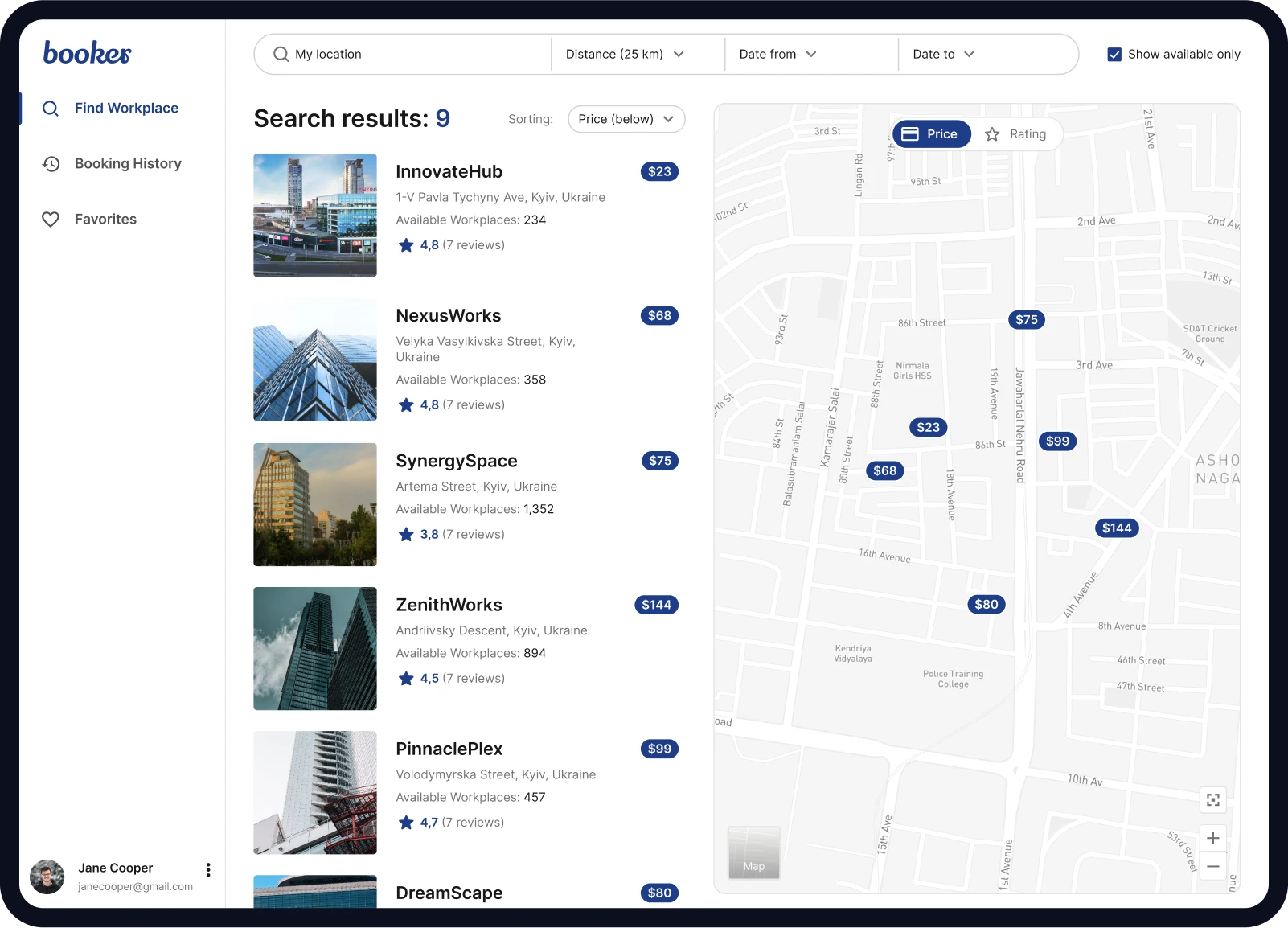

One workplace.
Two sides of the same friction.
Employees needed a fast way to find a place that matched where, when, and how they wanted to work. Workplace teams needed one reliable way to keep availability visible and bookings under control.
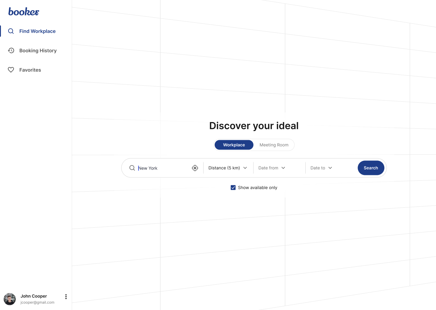
The fastest route starts with asking less.
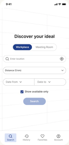
Location, distance, and dates are captured in one focused action—enough structure to begin without turning the first step into a form.
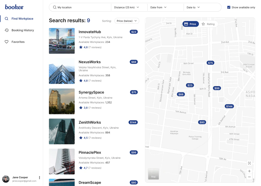
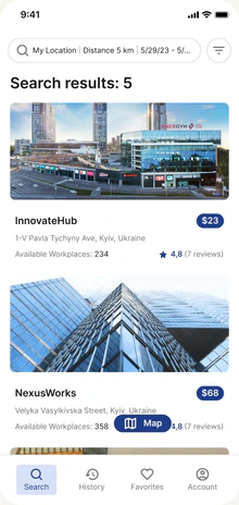
From “I need a desk” to a confident shortlist.
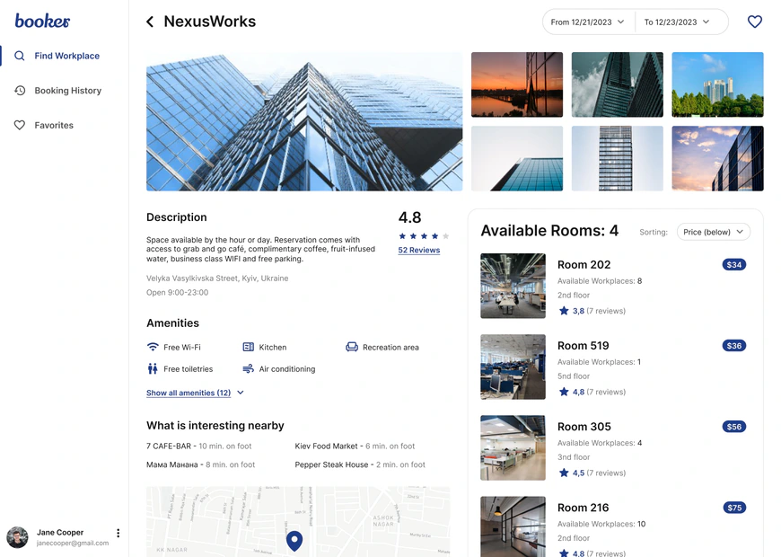
Location, distance, dates, availability, map context, ratings, and price remain visible at the moment they matter.
Enough detail to decide. Never enough noise to hesitate.
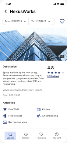
Workspace imagery, availability, amenities, rooms, ratings, and reviews form one progressive decision path.
From the right room to the right seat.
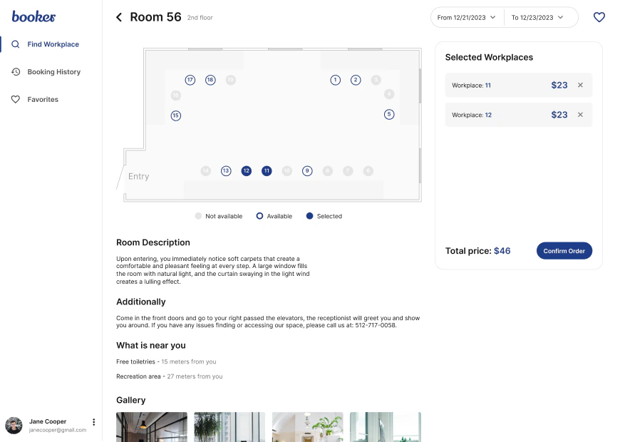
Availability becomes spatial and concrete. People can compare the room, understand the layout, and select workplaces without losing booking context.
ROOM CONTEXT · LIVE AVAILABILITY · MULTI-SEAT SELECTIONA checkout that keeps momentum—and trust.
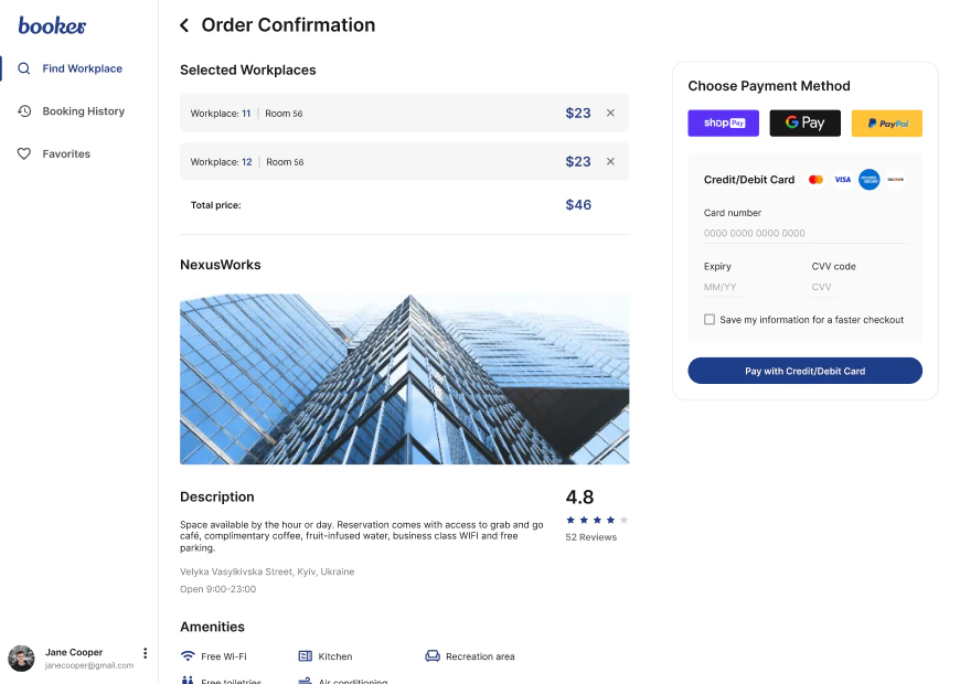
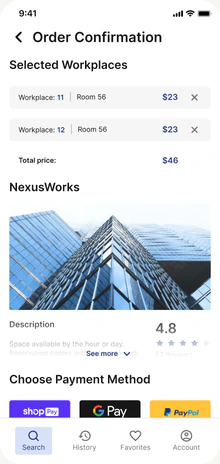
The selected place, schedule, seats, and price remain visible while payment stays compact, predictable, and easy to verify.
Booked. Clear on what happens next.
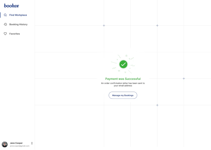
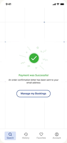
The final state confirms every essential detail and gives the user an obvious route back to their bookings—without adding another decision.
SUCCESS STATE · BOOKING SUMMARY · NEXT ACTION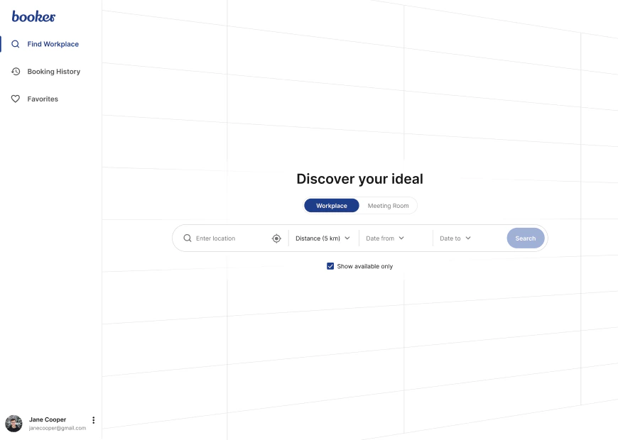
A checkout that keeps momentum—and trust.
Dates, room selection, payment details, review, and confirmation remain visibly connected.
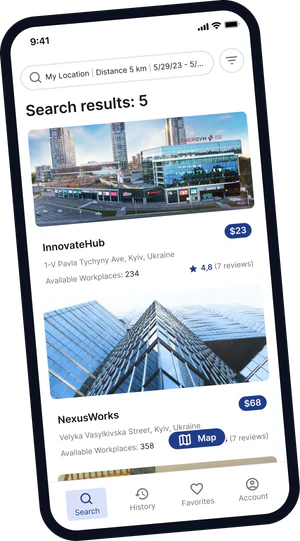
Not a smaller desktop.
A purpose-built mobile journey.
Navigation, filters, long content, checkout, and confirmation recompose around touch and focused decision-making.
A focused identity for
effortless booking.
The logo, color system, and typography work together to make Booker feel confident, clear, and quietly distinctive at every step.

Simple enough to guide, distinctive enough to remember.
The compact wordmark feels precise and dependable. Its restrained geometry supports a product that should feel helpful—not loud.
Deep blue builds trust, ink protects clarity, soft canvas keeps the interface calm, and active blue highlights selected states.
Find your next workspace.
Poppins gives headlines a friendly, architectural voice. Inter keeps search, details, and checkout fast to scan.
Tell us what you are building. We’ll reply with the clearest next step—usually within a few hours.